REN
BRANDING | GRAPHIC DESIGN | PHOTOGRAPHY
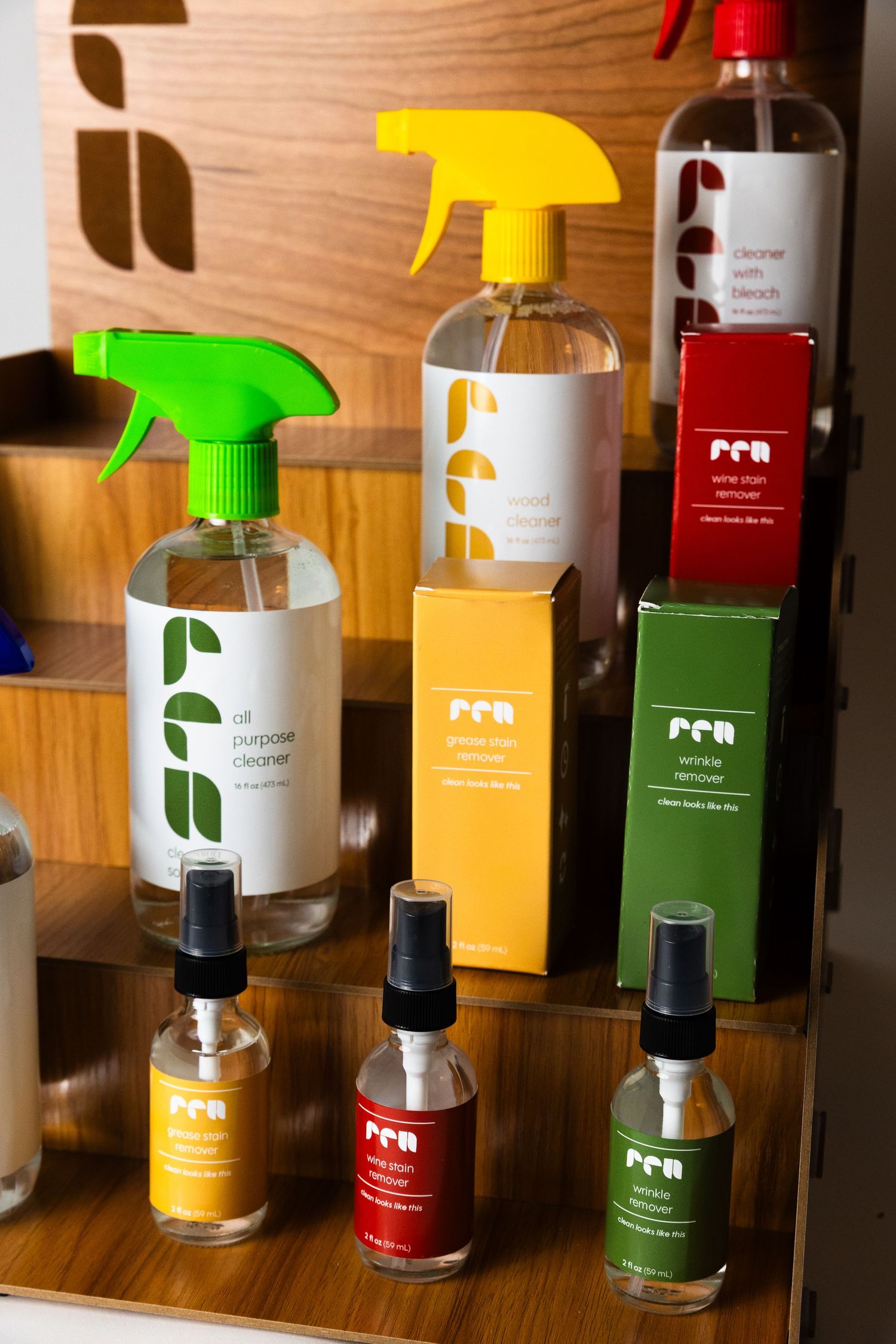
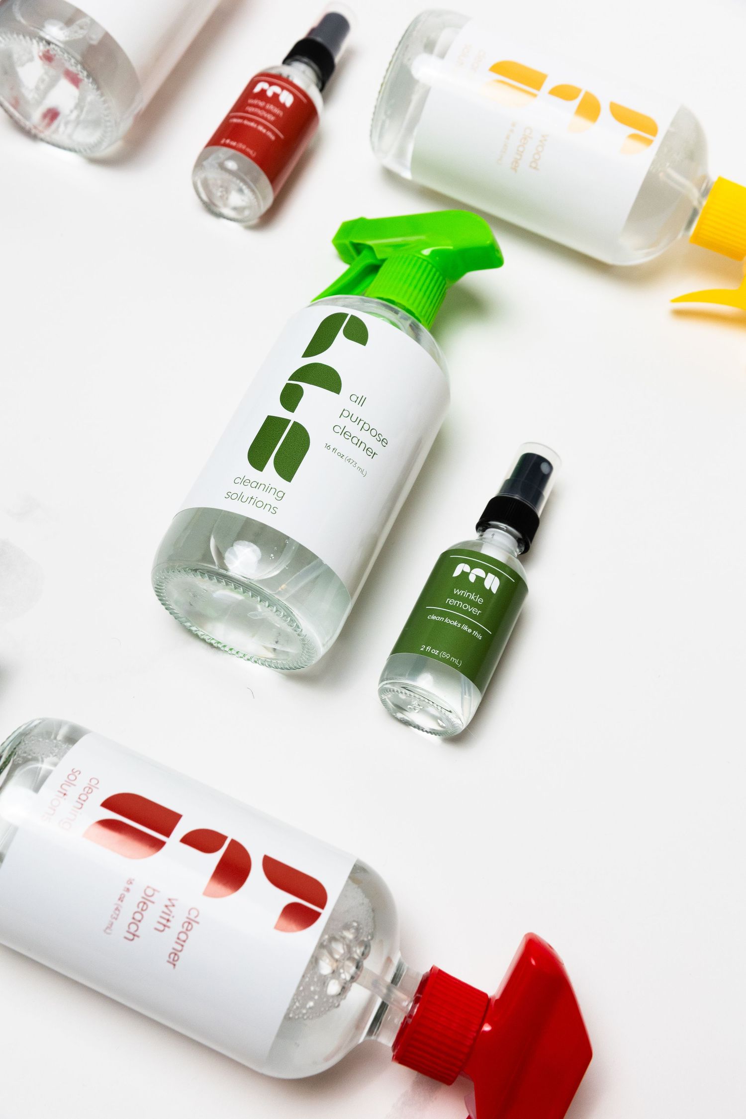
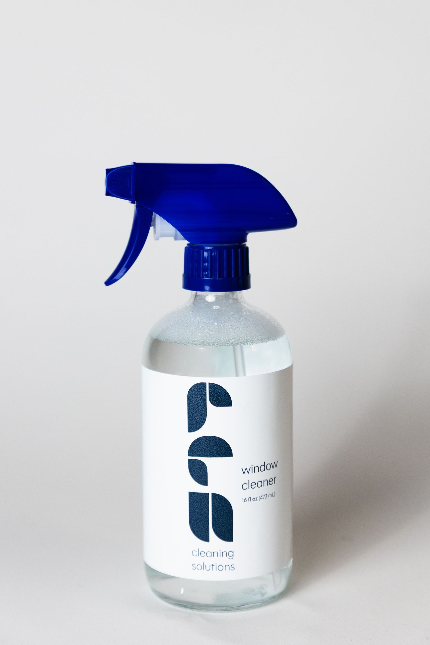
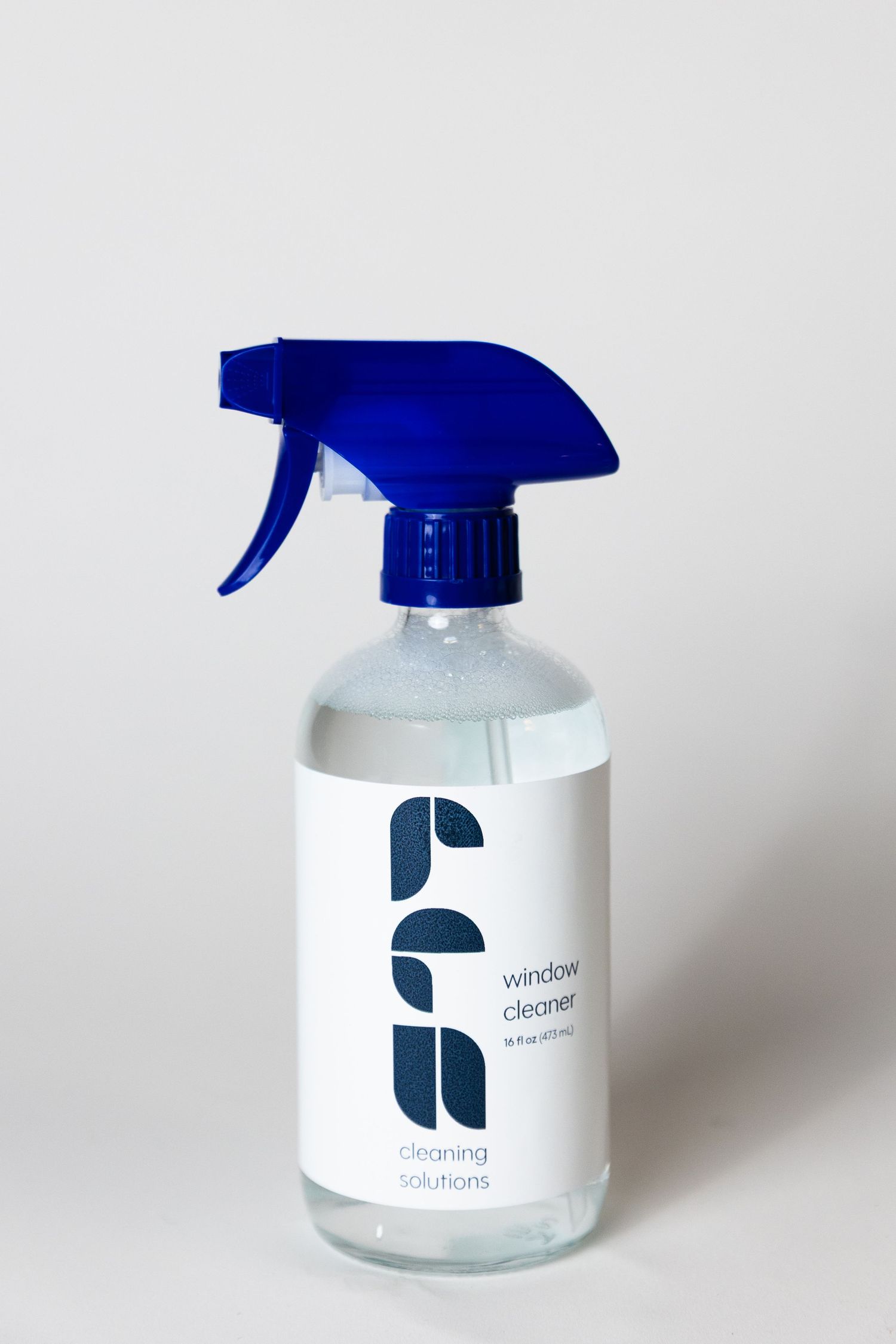
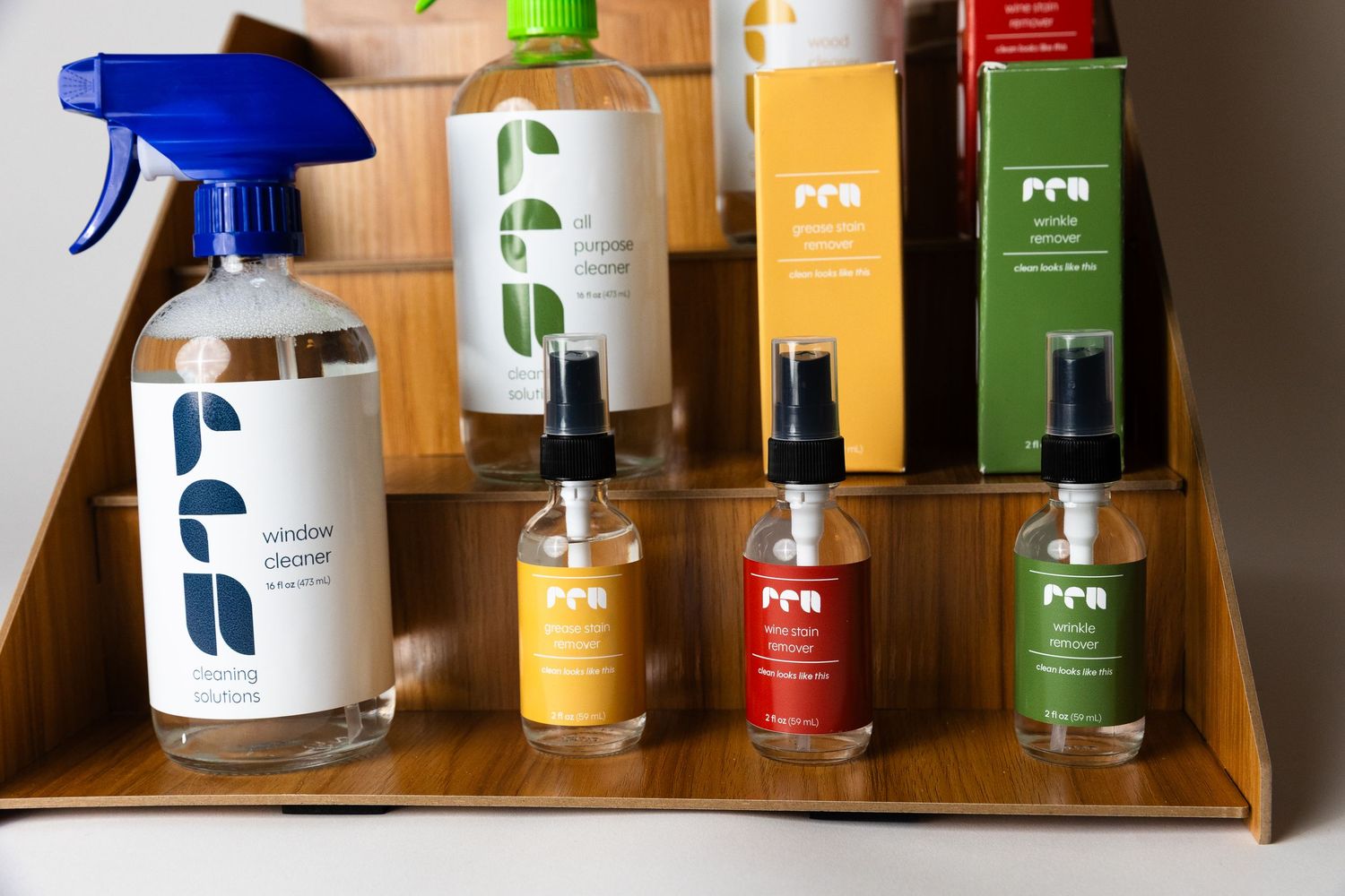
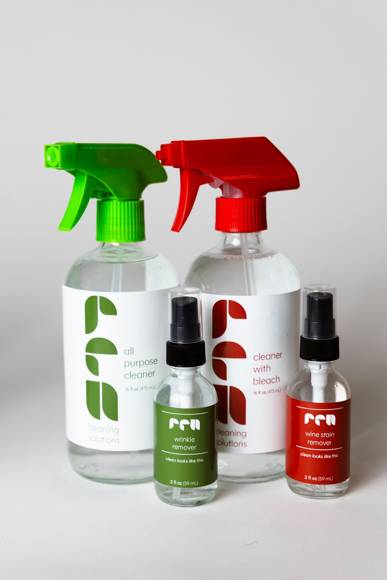
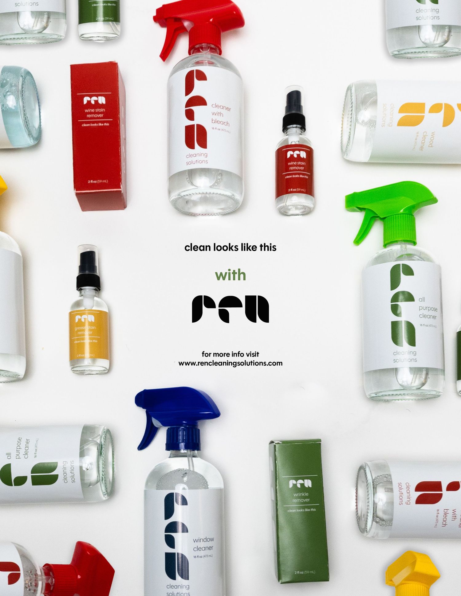
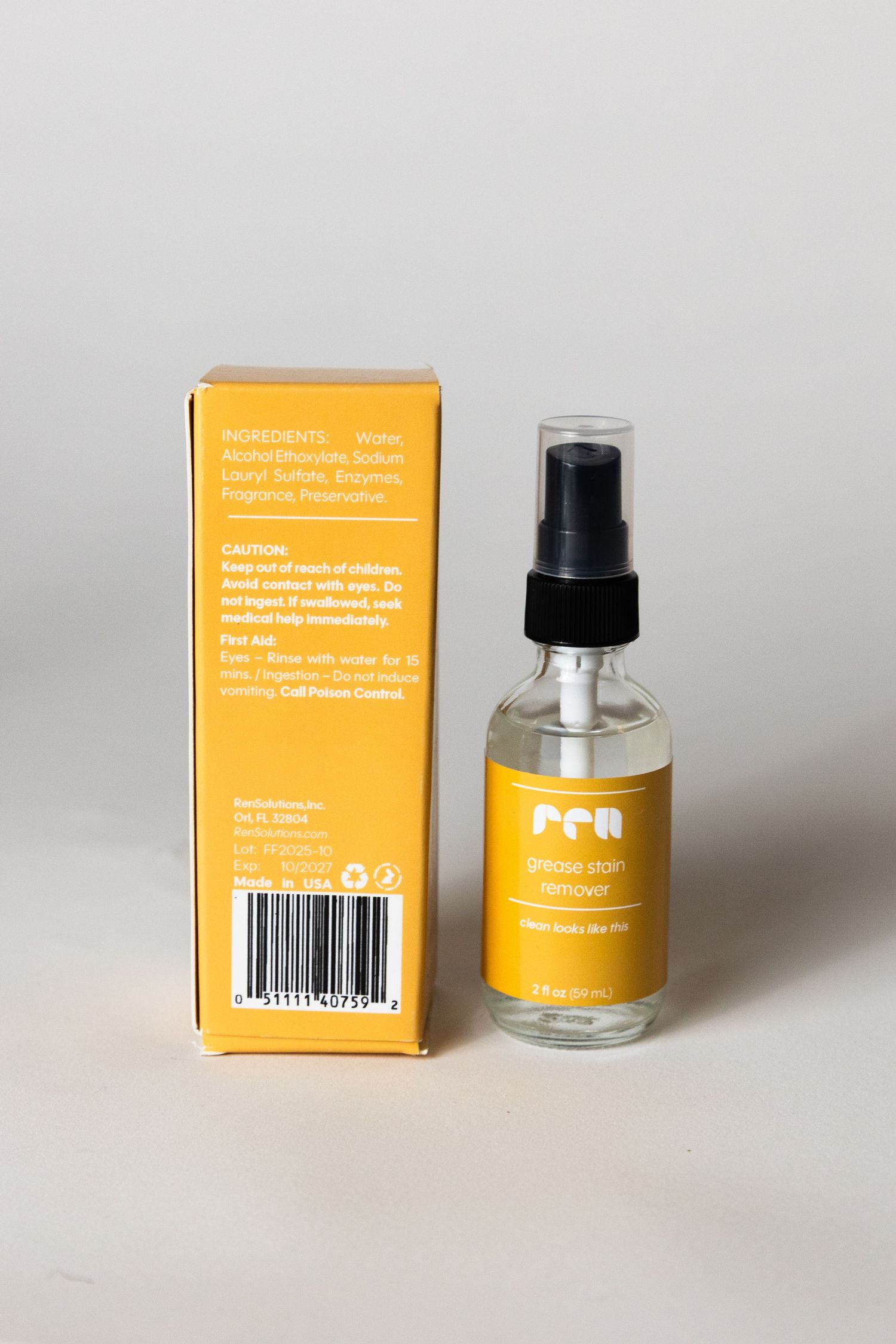
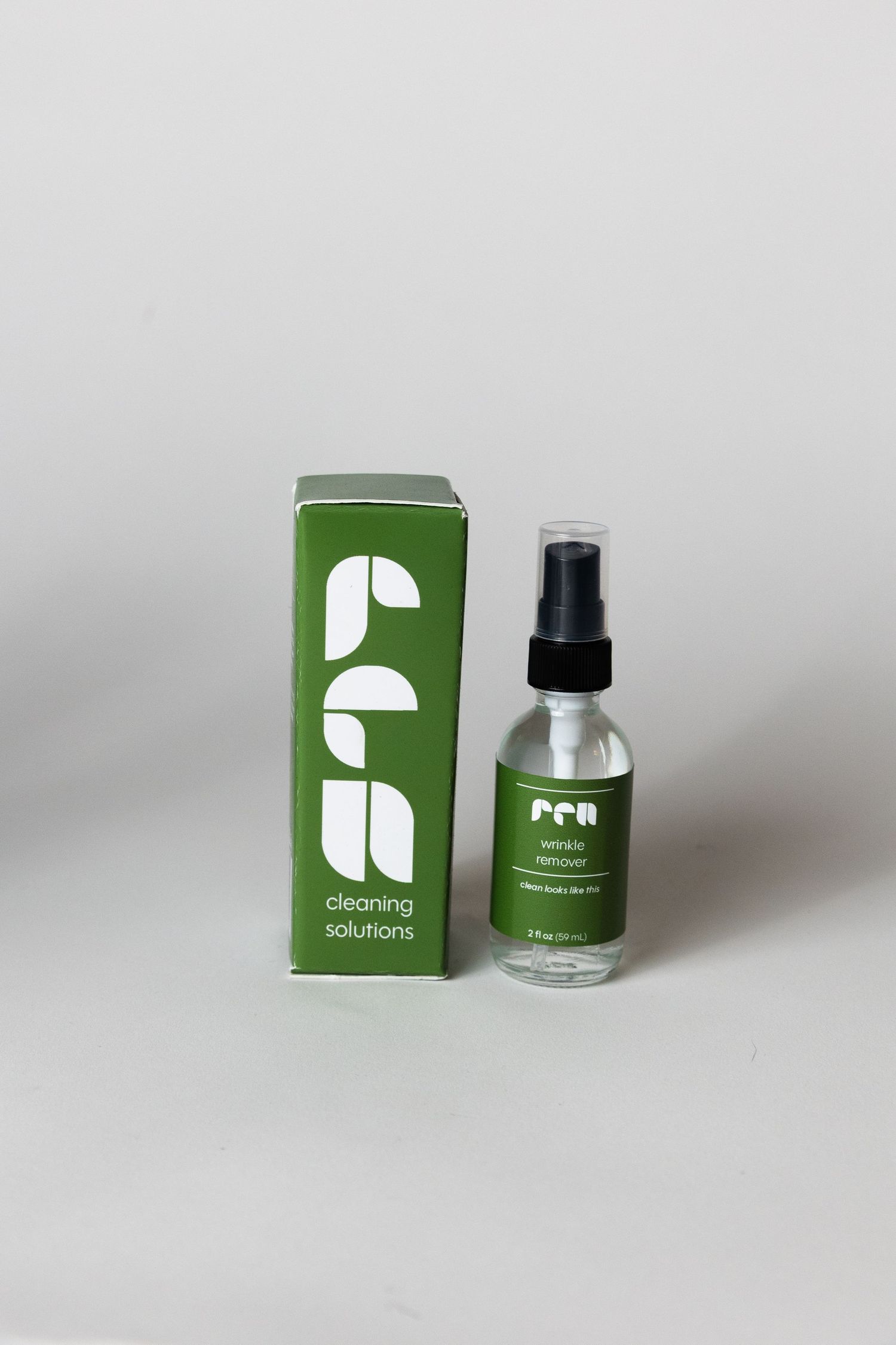
This packaging project re imagines the visual language of household cleaning products by challenging the category’s typically cluttered and overstimulating design conventions. The goal was to create a system that feels calm, intentional, and easy to navigate on shelf.
Drawing inspiration from Swiss design principles, the approach emphasizes minimalism, clarity, and strong visual hierarchy, proving that simplicity can still be bold and impactful.
The brand identity is built from design fundamentals. The logo and visual system rely on basic geometric shapes and a primary color palette, reducing elements to their core while maintaining a sense of structure and recognizability. The result is a clean, modern packaging system that stands apart from competitors while reinforcing the product’s purpose through clarity and restraint.